Overview:
- A lag in a time-series data is how much one point is falling behind in time from another data point.
- In a time-series data, data points are marked over time at varying degrees of intervals.
- To analyse and find out if a time-series data follows any pattern, a lag plot can be employed.
- A lag plot is drawn by representing the time series data in x-axis and the lag of the time series data point in y axis. For a data point, if the order of the lag is one, the lag is the previous data point. If the lag is two, the lag is data point before two data points in time.
- By drawing a lag plot, patterns like randomness, trends and seasonality can be searched for.
Lag plot through the plotting module of pandas:
- The pandas library provides a plotting module that has interafce for drawing several statistical plots.
- The function lag_plot() draws a lag plot for a given time series-data as a pandas series and for the given lag.
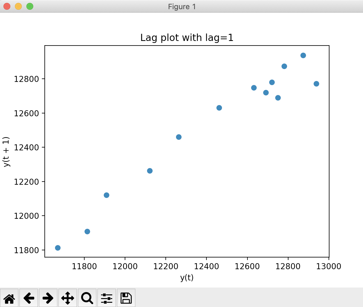
Example 1 - Lag plot showing strong auto correlation in the time-series data:
|
# Example Python program that draws a lag plot # Create a pandas Series # Draw a lag plot |
Output:
The example shows that the data exhibits high auto correlation behaviour as the points in the lag plot lie around the diagonal line.
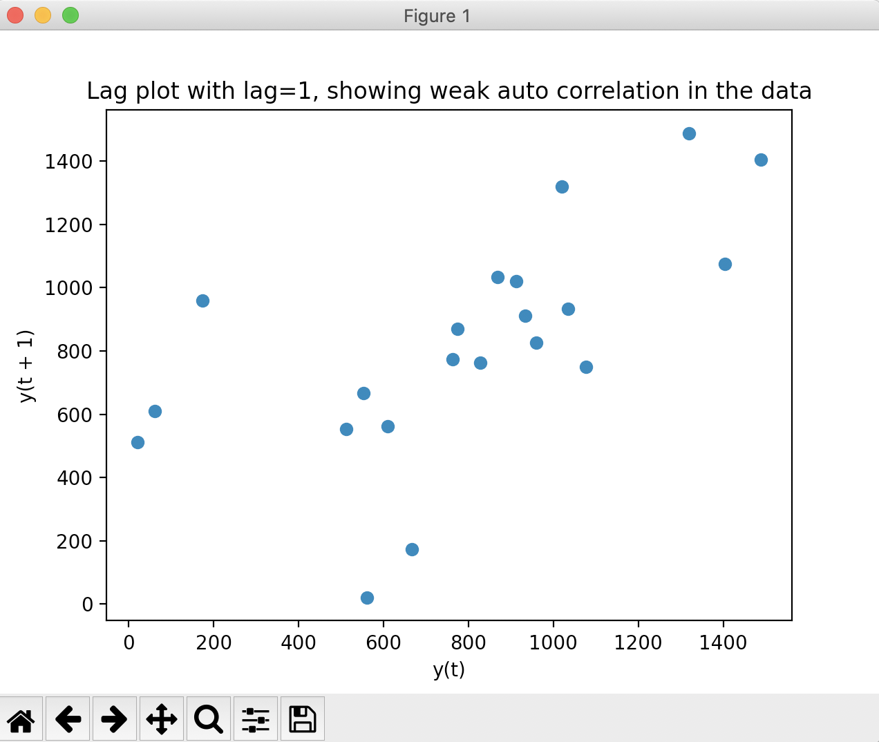
Example 2 - Lag plot showing weak auto correlation in the time-series data:
|
# Example Python program # Hourly averaged sensor response pds.plotting.lag_plot(hourlyAverage, lag=1); |
Output: