Overview:
- In a line chart, the data points are marked in a two-dimensional space at (x,y) positions and the points are connected through a line.
- Line chart is one of the simplest data visualization techniques yet a powerful one that gives an idea about the trend of a variable against another variable.
- For a pandas.Series instance, a line chart is drawn by calling the line() function on the plot member of the Series.
- In the same way, to draw a line chart for a pandas DataFrame, the line() function can be called on the DataFrame.plot member.
Example:
|
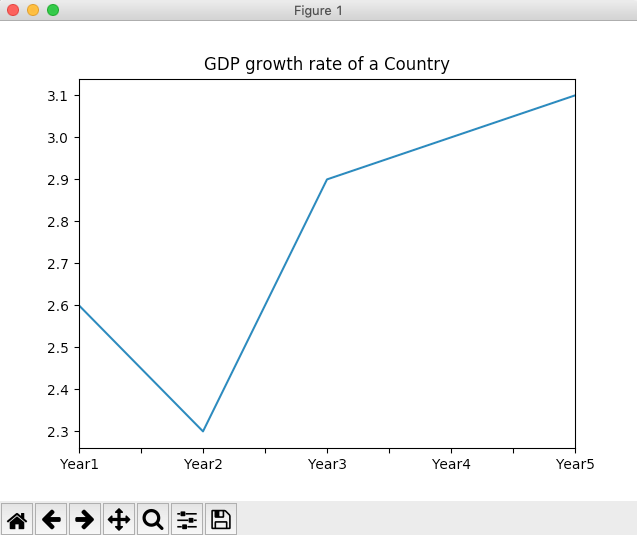
# Python example program to create a line chart import pandas as pds import matplotlib.pyplot as plt
# GDP growth percentages data = [2.6, 2.3, 2.9, 3, 3.1];
# Create a pandas Series series = pds.Series(data, index=("Year1", "Year2", "Year3", "Year4","Year5"));
# Draw line chart series.plot.line(title="GDP growth rate of a Country"); plt.show(block=True); |