Pie Chart:
- A pie chart is a circular statistical diagram.
- The area of the whole chart represents 100% or the whole of the data.
- The areas of the pies present in the Pie chart represent the percentage of parts of data.
- The parts of a pie chart are called wedges.
- The length of the arc of a wedge determines the area of a wedge in a pie chart.
- The area of the wedges determines the relative quantum or percentage of a part with respect to a whole.
- Pie charts are frequently used in business presentations as they give quick summary of the business activities like sales, operations and so on.
- Pie charts are also used heavily in survey results, news articles, resource usage diagrams like disk and memory.
Drawing a simple Pie Chart using Python Matplotlib
Pie charts can be drawn using the function pie() in the pyplot module. The below python code example draws a pie chart using the pie() function.
By default the pie() fucntion of pyplot arranges the pies or wedges in a pie chart in counter clockwise direction.
Example:
|
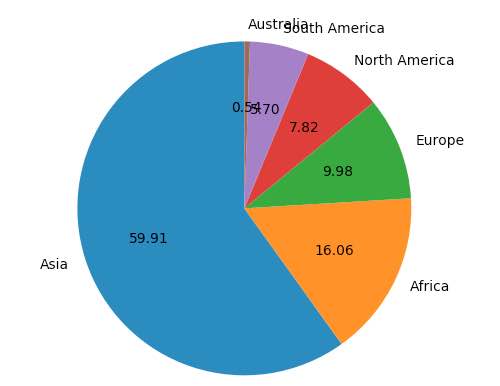
# import the pyplot library import matplotlib.pyplot as plotter
# The slice names of a population distribution pie chart pieLabels = 'Asia', 'Africa', 'Europe', 'North America', 'South America', 'Australia'
# Population data populationShare = [59.69, 16, 9.94, 7.79, 5.68, 0.54]
figureObject, axesObject = plotter.subplots()
# Draw the pie chart axesObject.pie(populationShare, labels=pieLabels, autopct='%1.2f', startangle=90)
# Aspect ratio - equal means pie is a circle axesObject.axis('equal')
plotter.show() |
Output:
Making a wedge in a pie chart to explode:
A wedge of a pie chart can be made to explode from the rest of the wedges of the pie chart using the explode parameter of the pie function.
explode is a tuple where each element corresponds to a wedge of the pie chart.
The length of the tuple should be equal to the number of pies in the pie chart.
Otherwise matplotlib will raise an exception of type ValueError.
Example:
|
explodeTuple = (0.1, 0.0, 0.0, 0.0, 0.0, 0.0)
# Draw the pie chart axesObject.pie(populationShare, explode=explodeTuple, labels=pieLabels, autopct='%1.2f', startangle=90) |
In the above snippet the pie() function is passed with a tuple for the explode argument. Only the first element of the tuple is mentioned a fraction while all other elements are zero, which will make only the first wedge of the pie chart to look apart from the rest of the chart.
Output:

Making multiple wedges of a pie chart to explode:
The above example made only one of the wedges of a pie chart to explode out.
In the following snippet a tuple is provided to the explode parameter of the pie() function. The tuple has its first and last entry as a non-zero fraction making the first and last wedges of the pie chart to explode.
Based on the numeric value of the elements in the tuple wedges are exploded to relatively higher or lower distances from the center point of the pie chart.
A negative value will make the wedge to appear in the opposite direction from the original position specified.
Example:
|
explodeTuple = (0.1, 0.0, 0.0, 0.0, 0.0, 0.8)
# Draw the pie chart axesObject.pie(populationShare, explode=explodeTuple, labels=pieLabels, autopct='%1.2f', startangle=90) |
Output:

Customizing colors in a pie chart drawn using Matplotlib:
The colors of the wedges in a pie chart can be customized using the parameter colors, of the pie() function. The colors parameters is a tuple containing the list of colors to be cycled for the wedges of a pie-chart.
Example:
|
# import the pyplot library import matplotlib.pyplot as plotter
# Guest age group ageGroupLabel = 'Below 5', '5-10', '10-15', '15-20', '20-30', '30-40', '40-50', '50-60', '60-80', '80-100', 'Above 100'
# Number of Guests expected in age group guestNumbers = [5, 10, 10, 15, 10, 30, 25, 25, 20, 15, 10]
figureObject, axesObject = plotter.subplots()
explode = (0.4, 0.0, 0.0, 0.0, 0.5, 0.5, 0.0, 0.0, 0.0, 0.0, 0.3) colors = ("red", "green", "orange", "cyan", "brown", "grey", "blue", "indigo", "beige", "yellow")
# Draw the pie chart axesObject.pie(guestNumbers, explode = explode, colors = colors, labels = ageGroupLabel, autopct = '%1.2f', startangle = 90)
# Aspect ratio axesObject.axis('equal')
plotter.show() |
Output:

In the output, since all the colors are exhaust when the age group “Above 100” is reached, colors are again taken from the beginning – that is assigning red to the age group “Above 100” which is the same age group of children.
Customizing a Matplotlib Pie Chart:
- The pie chart drawn using the Matplotlib.pyplot can be customized of its several aspects.
- The startangle parameter rotates the pie chart by the specified number of degrees. The rotation is counter clock wise and performed on X Axis of the pie chart.
- Shadow effect can be provided using the shadow parameter of the pie() function. Passing True will make a shadow appear below the rim of the pie chart. By default value of shadow is False and there will be no shadow of the pie chart.
- The wedges of the pie chart can be further customized using the wedgeprop parameter. A python dictionary with the name value pairs describing the wedge properties like edgecolor, linewidth can be passed as the wedgeprop argument.
- By setting the frame argument to True, the axes frame is drawn around the pie chart.
- Autopct parameter of the arc() function controls how the percentages are displayed in the wedges. Either format string starting with a % can be specified or a function can be specified.
e.g., %.1f will display percentage values in the format 25.0, 35.2 and so on.
%.2f%% will display percentage values in the format 50.25, 75.5 and so on.
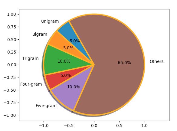
Example:
|
import matplotlib.pyplot as plotter
# Distribution of n-grams in a paragraph - maximum wordlength 5 wedgeLabels = ("Unigram", "Bigram", "Trigram", "Four-gram", "Five-gram", "Others")
# Percentage of n-grams ngramPercent = (5, 5, 10, 5, 10, 65)
figureObject, axesObject = plotter.subplots()
axesObject.pie(ngramPercent, labels = wedgeLabels, shadow = True, frame = True, startangle = 120, autopct = '%.1f%%', wedgeprops = { 'linewidth' : 3, 'edgecolor' : "orange" })
axesObject.axis('equal')
plotter.show() |
Output: