Overview:
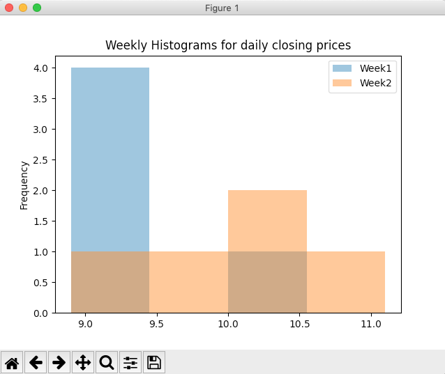
- A histogram is a frequency plot. Each interval data is marked with different heights based on the frequency of the data in that interval. Higher the frequency greater the height marked for that frequency.
- Calling the hist() method on the plot member of a DataFrame instance draws the histogram for each column present in the DataFrame.
- Number of bins or intervals of the histogram is specified for all the columns of the DataFrame combined.
- Each histogram will be drawn in an overlapping(if any) fashion using the alpha-blending value specified.
Example:
|
# Example Python program that plots # histograms for weekly data import pandas as pds import matplotlib.pyplot as plot
# Data dailyClosingPrices = [(10.2, 9.8), (9.4, 10.4), (8.9, 11.1), (9.0, 10.5), (9.1, 9.4) ];
# The index index = ["Mon", "Tue", "Wed", "Thu", "Fri"];
# Column labels columns = ["Week1", "Week2"];
# Create a DataFrame instance df = pds.DataFrame(data=dailyClosingPrices, index = index, columns = columns);
# Draw histograms for weekly closing prices df.plot.hist(bins=4, alpha=0.5, title="Weekly Histograms for daily closing prices"); plot.show(block=True); |
Output: