Overview:
- A bar chart displays a set of categories in one axis and the percentage or frequencies of a variable for those categories in another axis.
- The height of the bar is either less or more depending upon the frequency value.
- In a Vertical Bar Chart, the X-axis will represent categories and Y-axis will represent frequencies. In a Horizontal Bar Chart, it is the inverse.
- In a Vertical Bar Chart, the bars grow downwards below the X-axis for negative values.
- In a Horizontal Bar Chart, the bars grow leftwards from the Y-axis for negative values.
Plotting Bar charts using pandas DataFrame:
- While a bar chart can be drawn directly using matplotlib, it can be drawn for the DataFrame columns using the DataFrame class itself.
- The pandas DataFrame class in Python has a member plot. Using the plot instance various diagrams for visualization can be drawn including the Bar Chart.
- The bar() method draws a vertical bar chart and the barh() method draws a horizontal bar chart.
- The bar() and barh() of the plot member accepts X and Y parameters. By default, X takes the index of the DataFrame and all the numeric columns are drawn as Y.
- Any keyword argument supported by the method DatFrame.plot() can be passed to the bar() method in order to customize the bar chart. For example, the keyword argument title places a title on top of the bar chart.
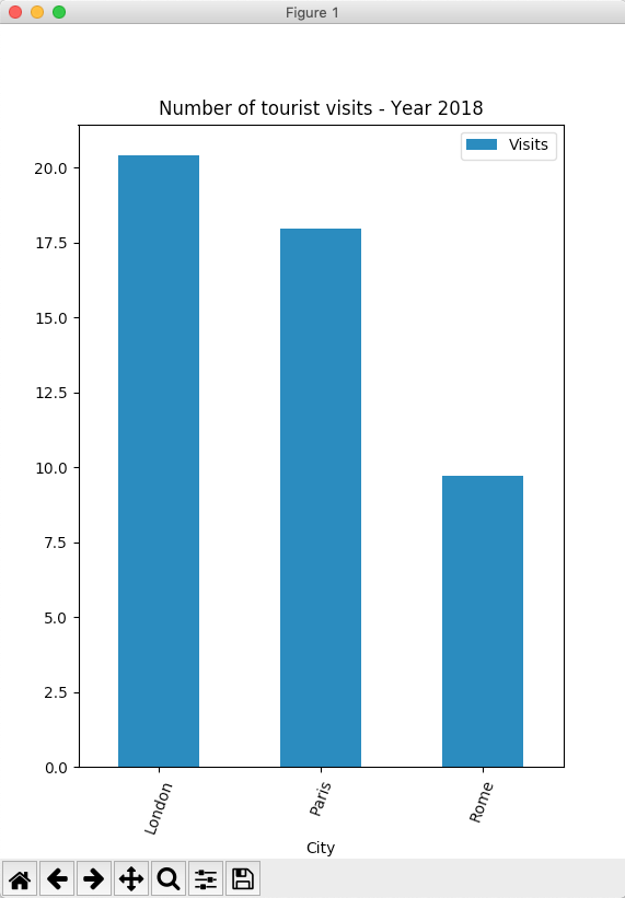
Example – Bar Chart of a pandas DataFrame: one column as X-axis and another as Y-axis:
|
import pandas as pd import matplotlib.pyplot as plot
# A python dictionary data = {"City":["London", "Paris", "Rome"], "Visits":[20.42,17.95,9.7] }; # Dictionary loaded into a DataFrame dataFrame = pd.DataFrame(data=data);
# Draw a vertical bar chart dataFrame.plot.bar(x="City", y="Visits", rot=70, title="Number of tourist visits - Year 2018"); plot.show(block=True); |
Output:
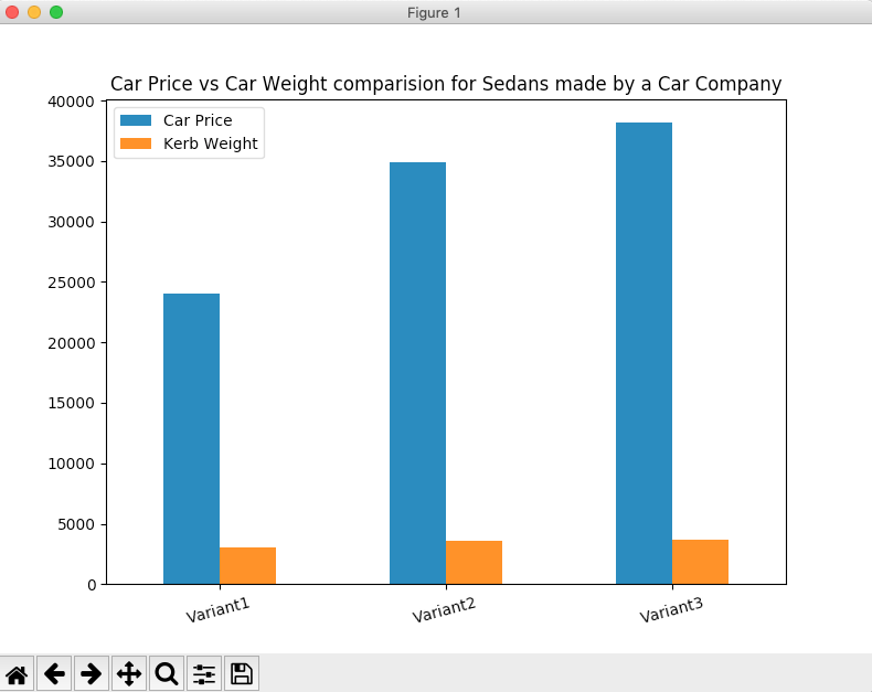
Compound Bar Chart or Nested Bar Chart:
The following Python code plots a compound bar chart combining two variables Car Price, Kerb Weight for the sedan variants produced by a car company.
Example:
|
# Example Python program to plot a complex bar chart import pandas as pd import matplotlib.pyplot as plot
# A python dictionary data = {"Car Price":[24050, 34850, 38150], "Kerb Weight":[3045, 3572, 3638] }; index = ["Variant1", "Variant2", "Variant3"];
# Dictionary loaded into a DataFrame dataFrame = pd.DataFrame(data=data, index=index);
# Draw a vertical bar chart dataFrame.plot.bar(rot=15, title="Car Price vs Car Weight comparision for Sedans made by a Car Company"); plot.show(block=True); |
Output:
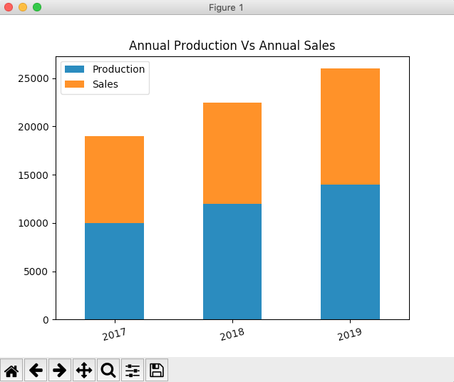
Stacked vertical bar chart:
A stacked bar chart illustrates how various parts contribute to a whole. The example Python code plots a pandas DataFrame as a stacked vertical bar chart. The Python code plots two variables - number of articles produced and number of articles sold for each year as stacked bars. The years are plotted as categories on which the plots are stacked.
Example:
|
# Example Python program to plot a stacked vertical bar chart import pandas as pd import matplotlib.pyplot as plot
# A python dictionary data = {"Production":[10000, 12000, 14000], "Sales":[9000, 10500, 12000] }; index = ["2017", "2018", "2019"];
# Dictionary loaded into a DataFrame dataFrame = pd.DataFrame(data=data, index=index);
# Draw a vertical bar chart dataFrame.plot.bar(stacked=True,rot=15, title="Annual Production Vs Annual Sales"); plot.show(block=True); |
Output:
Horizontal Bar Chart:
-
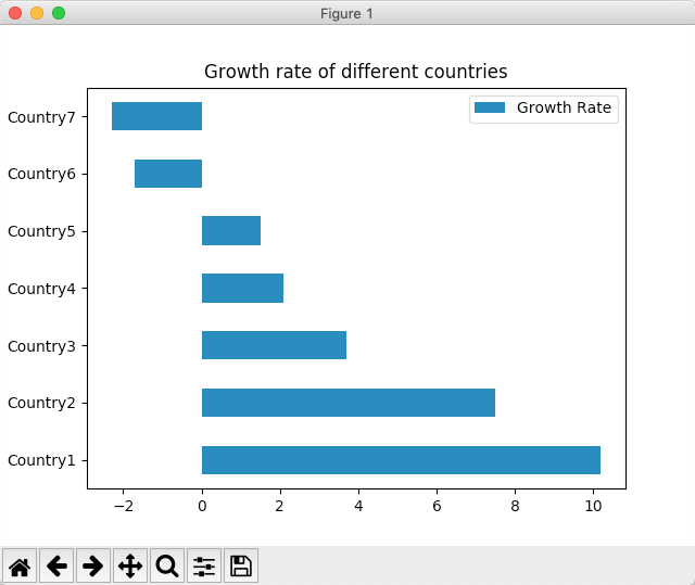
In a horizontal bar chart categories are drawn in Y-axis and the frequencies of the variables for the categories are drawn in X-axis.
- The Python example code plots the Growth Rate of different countries from a pandas DataFrame into a horizontal bar chart.
Example:
# Example python program to plot a horizontal bar chartimport pandas as pd import matplotlib.pyplot as plot
growthData = {"Countries": ["Country1", "Country2", "Country3", "Country4", "Country5", "Country6", "Country7"], "Growth Rate":[10.2, 7.5, 3.7, 2.1, 1.5, -1.7, -2.3]}; dataFrame = pd.DataFrame(data = growthData); dataFrame.plot.barh(x='Countries', y='Growth Rate', title="Growth rate of different countries"); plot.show(block=True); |
Output:
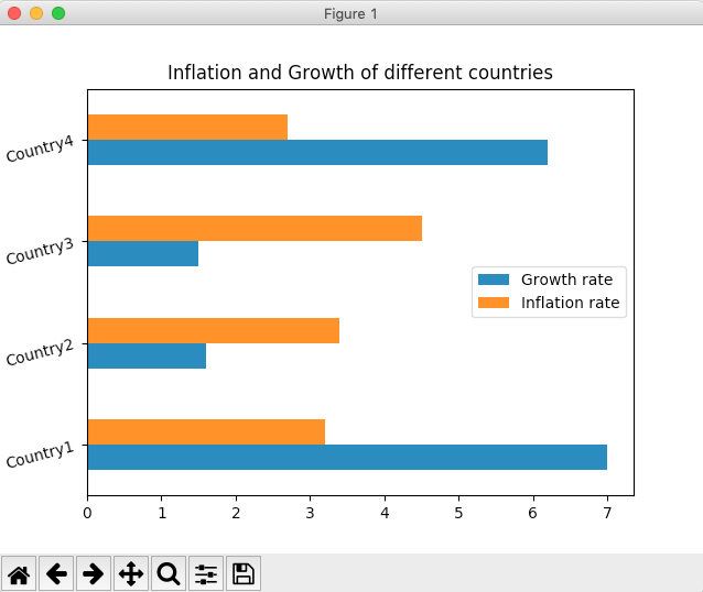
Compound horizontal bar chart:
A compound horizontal bar chart is drawn for more than one variable. For each variable a horizontal bar is drawn in the corresponding category. The example Python code plots Inflation and Growth for each year as a compound horizontal bar chart.
Example:
# Example python program to plot a compound horizontal bar chart# using pandas DataFrame import pandas as pd import matplotlib.pyplot as plot
# Python dictionary inflationAndGrowth = {"Growth rate": [7, 1.6, 1.5, 6.2], "Inflation rate":[3.2, 3.4, 4.5, 2.7]}; index = ["Country1", "Country2", "Country3", "Country4"];
# Python dictionary into a pandas DataFrame dataFrame = pd.DataFrame(data = inflationAndGrowth); dataFrame.index = index;
dataFrame.plot.barh(rot=15, title="Inflation and Growth of different countries"); plot.show(block=True); |
Output:
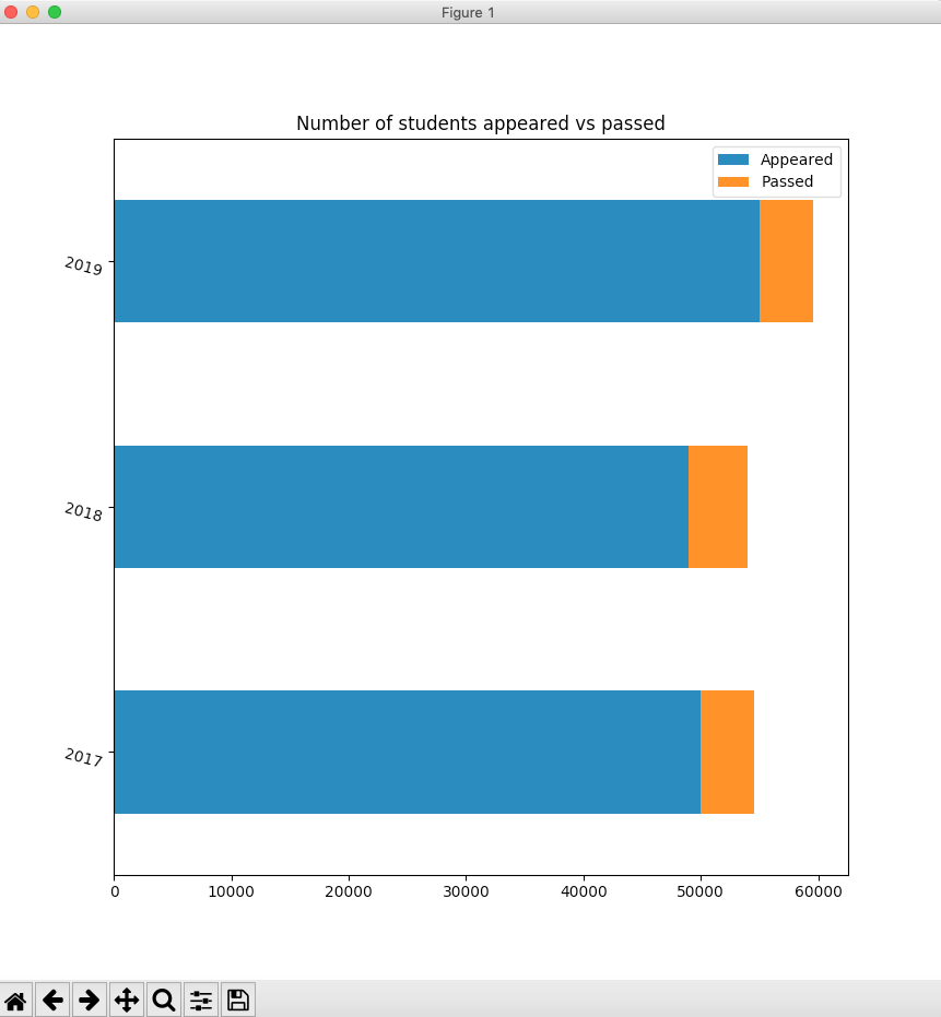
Stacked horizontal bar chart:
A stacked horizontal bar chart, as the name suggests stacks one bar next to another in the X-axis. The significance of the stacked horizontal bar chart is, it helps depicting an existing part-to-whole relationship among multiple variables. The pandas example, plots horizontal bars for number of students appeared in an examination vis-a-vis the number of students who have passed the examination.
Example:
|
# Example Python program to plot a stacked horizontal bar chart import pandas as pd import matplotlib.pyplot as plot
# A python dictionary data = {"Appeared":[50000, 49000, 55000], "Passed":[4500, 5000, 4600] }; index = ["2017", "2018", "2019"];
# Python Dictionary loaded into a DataFrame dataFrame = pd.DataFrame(data=data, index=index);
# Draw a stacked horizontal bar chart dataFrame.plot.barh(stacked=True,rot=-15, title="Number of students appeared vs passed"); plot.show(block=True); |