Bar Charts – Overview:
- A bar chart has categories or related variables in X-axis and their frequencies in Y-axis. For example, stock market returns for various years - X-axis will be years and Y-axis will be the average returns.
- Bar charts compare variables, categories against their frequency of occurrence.
Example:
|
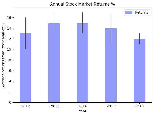
# import numpy and pyplot modules import numpy as np import matplotlib.pyplot as plotter
numberOfYears = 5 # Number of categories, variables averageReturns = (13, 15, 15, 14, 12) # Frequency of the variable standardDeviation = (3, 2, 2, 3, 1) # Error
figureObejct, axesObject = plotter.subplots()
# X Axis categories categories = np.arange(numberOfYears)
# Customize bar properties barWidth = 0.4 barOpacity = 0.5 errorConfig = {'ecolor': '0.2'}
# Draw the bar chart depicting annual stock market returns with standard deviation barChart = plotter.bar(categories, averageReturns, barWidth, alpha = barOpacity, color = 'blue', yerr = standardDeviation, error_kw = errorConfig, label = 'Returns')
# Fill the bar chart with information plotter.xlabel('Year') plotter.ylabel('Average returns from Stock Market %') plotter.title('Annual Stock Market Returns %') plotter.xticks(categories, ('2012', '2013', '2014', '2015', '2016')) plotter.legend()
plotter.tight_layout() plotter.show() |
Output:
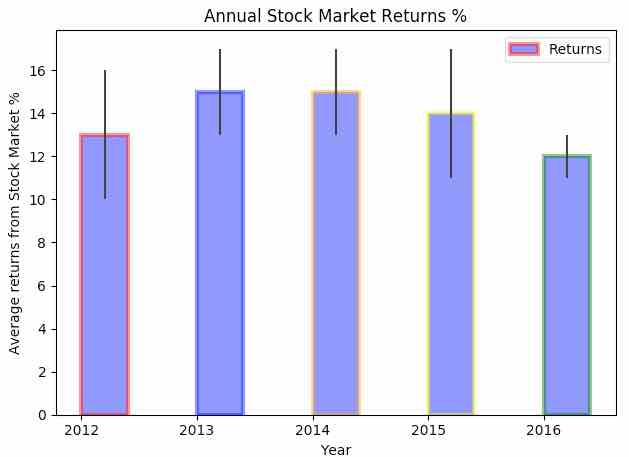
- A bar chart drawn using the function pyplot.bar() can be further customized using various parameters of the bar() function.
- The thickness of the lines of the bars in the bar chart can be controlled through the parameter linewidth. Either a line thickness can be specified for all bars or a value can be specified for each of the bars.
- The edgecolor parameter controls the colors of the bar edges.
- Bars can be aligned left side to an X-axis tick by specifying ‘left’ as the value for the align parameter. The value ‘center’ will make the bar align central to the tick. If the bar needs to be right aligned negative value need to be specified for the width parameter.
- The bar chart can be set to log scale by specifying ‘True’ as the value for the parameter log. Log scale is useful when the plot is drawn for data corresponding to large magnitudes. In logarithmic scale, the value on each tick on an axis is a constant multiplied by the previous tick value.
Example:
|
edgeColors = ('red','blue','orange','yellow','green')
# Draw the bar chart depicting annual stock market returns with standard deviation barChart = plotter.bar(categories, averageReturns, barWidth, alpha = barOpacity, color = 'blue', edgecolor=edgeColors, linewidth = 3, yerr = standardDeviation, error_kw = errorConfig, label = 'Returns', orientation = 'vertical', log='False', align='center') |
Output:
Drawing a Horizontal Bar Chart using Python Matplotlib:
- A bar chart can be drawn horizontally as well.
- matplotlib.pyplot supports drawing horizontal bar charts with the function hbar().
Example:
|
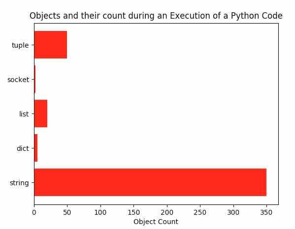
# Example program that draws a horizontal bar chart import matplotlib.pyplot as plotter import numpy as np
# Python object types objectTypes = ('string', 'dict', 'list', 'socket', 'tuple') yAxisCategories = np.arange(len(objectTypes)) objectCount = (350, 5, 20, 2, 50) # number of python objects created stdDeviation = (0, 0, 0, 0, 0) # metrics are actual hence no error
figureObject, axesObject = plotter.subplots() hBarChart = plotter.barh(yAxisCategories, objectCount, xerr=stdDeviation, align='center', color='red', ecolor='blue')
axesObject.set_title('Objects and their count during an Execution of a Python Code') axesObject.set_yticks(yAxisCategories) axesObject.set_yticklabels(objectTypes) axesObject.set_xlabel('Object Count')
plotter.show() |
Output: