Overview:
- Correlation measures the relationship or association between two variables or two datasets
- Correlation measures both the vigor of the association as well as the direction of association between two variables.
- The measure of Correlation is represented by ρ (rho) or simply ‘r’ which is also called as the "Correlation Coefficient"
- Correlation captures the linear relationship between two variables and it ranges from -1 to 0 to +1
- A perfect positive measure of correlation yields a value of +1, this means that if variable 1 increases or decreases by x%, then variable 2 also increases or decreases by x% respectively.
- A perfect negative measure of correlation yields a value of -1, this means that if variable 1 increases by x%, then variable 2 decreases by x%. Hence a negative sign denotes an inverse association between the two variables in study.
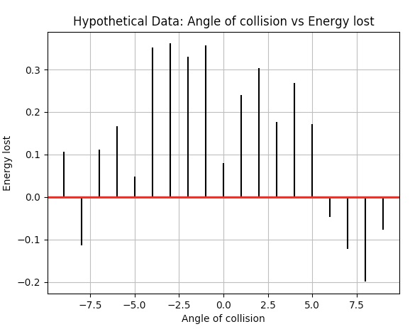
Example:
|
import matplotlib.pyplot as plot import numpy as np
# Angle of collision - variable 1 in correlation example xData = np.array([24.40,10.25,20.05,22.00,16.90,7.80,15.00,22.80,34.90,13.30])
# Energy lost - variable 2 in correlation example yData = np.array([-4.40,0.25,-0.05,2.00,6.90,-0.80,5.00,2.80,-4.90,3.30])
# Draw the scatter plot lines = plot.xcorr(xData, yData, maxlags=9, usevlines=True) plot.title('Hypothetical Data: Angle of collision vs Energy lost') plot.xlabel('Angle of collision') plot.ylabel('Energy lost') plot.grid(True) plot.axhline(0, color='red', lw=2) plot.show() |
Output: