Overview:
- Error bars indicate how much each data point in a plot deviates from the actual value.
- Error bars display the standard deviation of the distribution while the actual plot depicts the shape of the distribution.
- For graphs present in the research papers it is a necessary to display the error value along with the data points which depicts the amount of uncertainty present in the data.
- The function matplotlib.pyplot.errorbar() plots given x values and y values in a graph and marks the error or standard deviation of the distribution on each point.
Example:
|
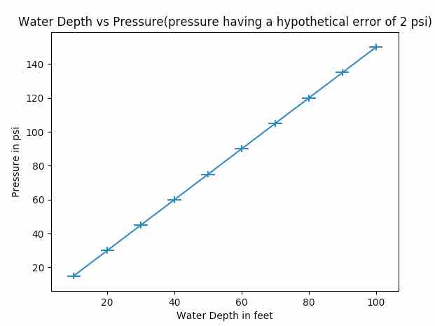
import numpy as np import matplotlib.pyplot as plot
# Depth data xData = np.arange(10, 110, 10)
multiplesOf = 15 dataCount = 10
# Water pressure data yData = list(range(multiplesOf, (dataCount+1)*multiplesOf, multiplesOf))
# Set error values for X axis and Y axis data xerror = 2 yerror = 2
# Draw the plot with error bars plot.errorbar(xData, yData, xerr=xerror, yerr=yerror, errorevery=1, markeredgewidth=10)
# Set X axis label for the errorbar graph plot.xlabel('Water Depth in feet')
# Set Y axis label for the errorbar graph plot.ylabel('Pressure in psi')
# Set Title for the errorbar graph plot.title('Water Depth vs Pressure(pressure having a hypothetical error of 2 psi)')
# Display the errorbar graph plot.show() |
Output: