Overview:
- A broken bar chart is used when the data involved varies significantly in the range of their values.
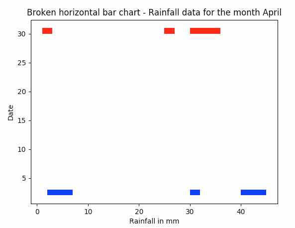
- For example, 5mm, 45mm, 32mm are rainfall data with huge variation in their range. A broken bar chart will be appropriate to plot such data to encompass and visualize both the smaller and higher ranges of values.
- The python module matplotlib.broken_barh() plots a broken horizontal bar chart.
- Different colors can be given for the broken horizontal bars using the facecolors parameter of the broken_barh() function.
Example:
|
import matplotlib.pyplot as plot
# Rainfall data - 2nd day of the month for plotting broken horizontal bar chart xranges = [(2,5), (40,5),(30,2)] yrange = (2,1)
# Plot the broken horizontal bars plot.broken_barh(xranges, yrange, facecolors='blue')
# Rainfall data - 30th day of the month for plotting broken horizontal bar chart xranges = [(1,2), (25,2),(30,6)] yrange = (30,1)
# Plot the broken horizontal bars plot.broken_barh(xranges, yrange, facecolors='red')
# Give the title for the broken horizontal bar chart plot.title('Broken horizontal bar chart - Rainfall data for the month April')
# Give x axis label for the broken horizontal bar chart plot.xlabel('Rainfall in mm')
# Give y axis label for for the broken horizontal bar chart plot.ylabel('Date')
plot.show() |
Output:
