Overview:
-
A 2D Histogram is very similar to the 1D Histogram.
- In a 2D Histogram, class intervals are drawn in both X-axis and the Y-axis.
- Unlike a 1D Histogram, 2D Histogram is plotted by counting the combination of values that occur in X and Y class intervals - and marking the densities.
- A 2D Histogram is useful when there is lot of data in a bivariate distribution. 2D Histogram simplifies visualizing the areas where the frequency of variables is dense.
- To plot a 2D histogram the length of X data and Y data should be equal.
- Matplotlib provides hist2d() as part of the matplotlib.pyplot module which is used for plotting 2D Histograms.
Example:
|
import matplotlib.pyplot as plot import numpy as np
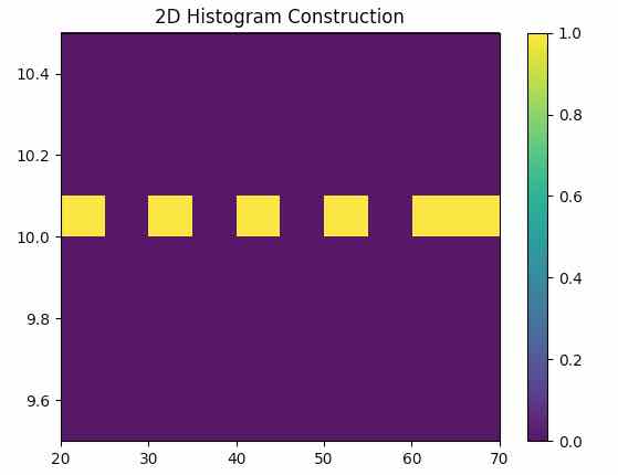
# Data 1 x = (20, 30, 40, 50, 60, 70) y = (10, 10, 10, 10, 10, 10)
# Plot frequency distribution using histogram plot.hist2d(x, y) plot.title("2D Histogram Construction") plot.margins(0) plot.colorbar() # Display the histogram plot.show() |
Output:

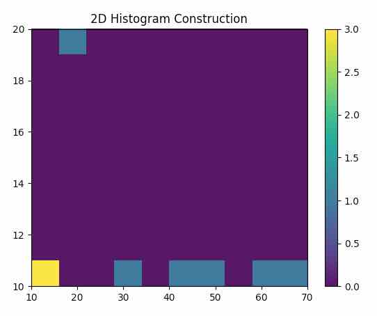
By changing the data as the 2D-Histogram changes depicting the more number of 10s added in the x and y with increased density denoted by the yellow square, in the output below
New data is given by,
x = (20, 30, 40, 50, 60, 70,10,10,10)
y = (20, 10, 10, 10, 10, 10,10,10,10)
The color bar aids in decoding the density values.
Output:
