Drawing a scatter plot using Matplotlib
Overview:
- A scatter plot is a two dimensional graph that depicts the correlation or association between two variables or two datasets
- Correlation displayed in the scatter plot does not infer causality between two variables.
- The above point means that the scatter plot may illustrate that a relationship exists, but it does not and cannot ascertain that one variable is causing the other.
- Either of the variables can be considered in either of the axes.
- A scatter plot is usually drawn prior to fitting a regression line or while analyzing the relationship between two variables.
- The python module matplotlib.pyplot has the function scatter()which generates scatter plots from two different arrays of datasets.
Example:
|
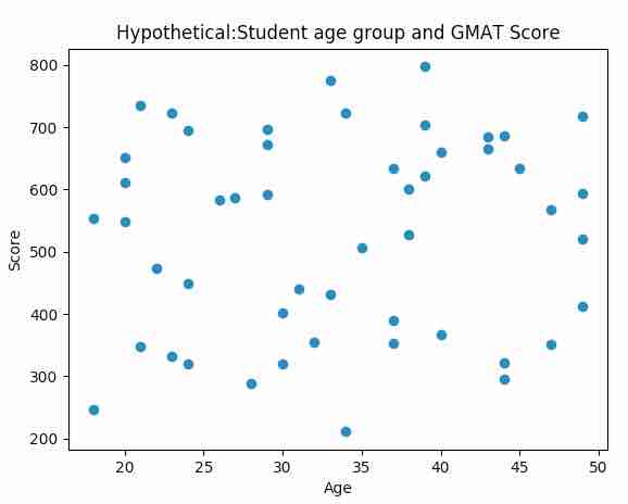
# import pyplot and numpy modules import matplotlib.pyplot as plot import numpy as np
# Hypothetical equity returns xData = np.random.random_integers(18, 50, 50) yData = np.random.random_integers(200, 800, 50)
# Draw the scatter plot plot.scatter(xData, yData) plot.title('Hypothetical:Student age group and GMAT Score') plot.xlabel('Age') plot.ylabel('Score') plot.show() |
Output: