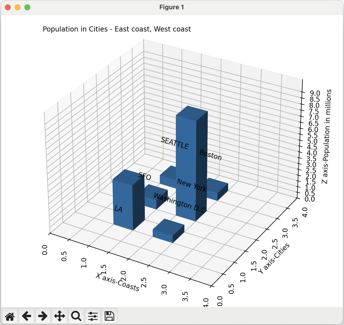
3d Bar Charts Using The Python Library Matplotlib

Overview:

  • The 3-dimensional bar chart functionality provided by the Python matplotlib library has both X axis and Y axis used for categories and has the height of the bar in Z axis to specify the frequency.
  • The x, y, z parameters of the bar3d() function defines where to start the bars in the X, Y and Z axes.
  • The dx, dy and dz parameters of the bar3d() function tells how big the bar should be in X, Y and Z axis dimensions. The dx parameter defines the width of the bar in X axis, the dy parameter defines the depth of the bar in Y axis and the dz parameter defines the height of the bar in Z axis.

Example:

# Example Python program that plots a 3d-bar chart
import matplotlib.pyplot as plt
import numpy as npy

# import the required style
plt.style.use('_mpl-gallery')

# X locations of the bar
xStart = [1, 1, 1, 2, 2, 2]

# Y locations of the bar
yStart = [1, 2, 3, 1, 2, 3]

# Z locations of the bar - 
# where all the bars in z start
zStart = [0, 0, 0, 0, 0, 0]

# X axis width of the bar
xWidth = npy.ones_like(xStart) * 0.5

# Y axis depth of the bar
yDepth = npy.ones_like(yStart) * 0.5

# Height of the bar - Z Axis
# in proportion to the population of the cities
zHeight = [3.82, 0.808, 0.749, 0.62, 8.4, 0.651]


# Plot 3d bars
figure, axes = plt.subplots(1, 1, subplot_kw={"projection": "3d"})

# Set the graph size
figure.set_size_inches(7, 6)

# Plot 3d bars
axes.bar3d(xStart, yStart, zStart, xWidth, yDepth, zHeight)
labels = ("LA", "SFO", "SEATTLE", "Washington D.C", "New York", "Boston")

# Place labels over the plot
for xv, yv, zv, label in zip(xStart, yStart, zStart, labels):
       axes.text(xv, yv, max(xv, yv, zv), label, (1, 0, 0))

# Create ten intervals from 0 to 9 in Z axis
axes.set_zlim(0, 10)

# Create eight intervals from 0 to 4 each measuring 0.5 in X axis
# and Y axis
bins = npy.linspace(0, 4, 9)
plt.xticks(bins, rotation = 90)
plt.yticks(bins, rotation = 90)

# Create eighteen intervals from 0 to 9 each measuring 0.5 in Z axis
bins = npy.linspace(0, 9, 19)
axes.set_zticks(bins)

# Set labels for X, Y and Z axis
axes.set_xlabel('X axis-Coasts')
axes.set_ylabel('Y axis-Cities')
axes.set_zlabel('Z axis-Population in millions')

# Place a title for the graph
axes.text2D(0.05, 0.95, 
            "Population in Cities - East coast, West coast", 
            transform = axes.transAxes)

# Finally display the 3d-bar plot
plt.show()

Output:

3d bar chart using matplotlib


Copyright 2024 © pythontic.com