Overview:
- A semi log plot is a graph where the data in one axis is on logarithmic scale (either X Axis or Y axis) and the data in the other axis is on normal scale – that is linear scale.
- On a linear scale as the distance in the axis increases the corresponding value also increases linearly.
- On a logarithmic scale as the distance in the axis increases the corresponding value increases exponentially.
- Examples of logarithmic scales include growth of microbes, mortality rate due to epidemics and so on.
- When the values of data vary between very small values and very large values – the linear scale will miss out the smaller values thus conveying a wrong picture of the underlying phenomenon.
- While using logarithmic scale both smaller valued data as well as bigger valued data can be captured in the plot more accurately to provide a holistic view of the data.
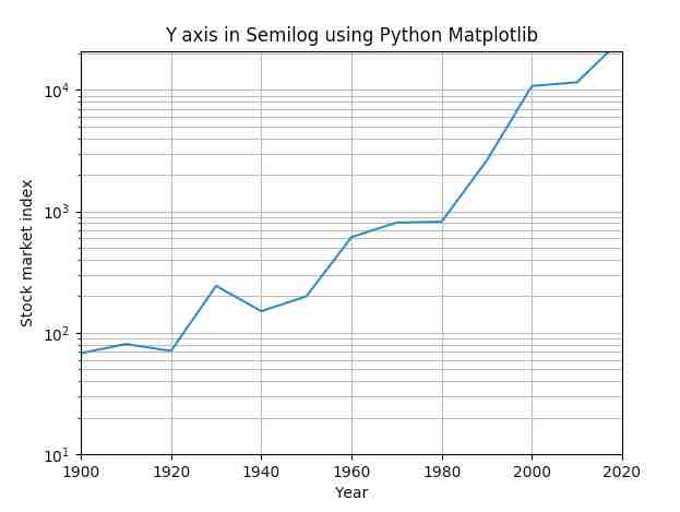
- The function semilogy() from matplotlib.pyplot module plots the y axis in logarithmic scale and the X axis in linear scale.
Example:
|
import matplotlib.pyplot as plot import numpy as np
# Year data for the semilog plot years = [1900, 1910, 1920, 1930, 1940, 1950, 1960, 1970, 1980, 1990, 2000, 2010, 2017]
# index data - taken at end of every decade - for the semilog plot indexValues = [68, 81, 71, 244, 151, 200, 615, 809, 824, 2633, 10787, 11577, 20656]
# Display grid plot.grid(True, which="both")
# Linear X axis, Logarithmic Y axis plot.semilogy(years, indexValues ) plot.ylim([10,21000]) plot.xlim([1900,2020])
# Provide the title for the semilog plot plot.title('Y axis in Semilog using Python Matplotlib')
# Give x axis label for the semilog plot plot.xlabel('Year')
# Give y axis label for the semilog plot plot.ylabel('Stock market index')
# Display the semilog plot plot.show() |
Output: