Histogram Overview:
- A Histogram is a vertical bar chart.
- A Histogram has continuous intervals in the X-axis and the frequencies in the Y-axis.
- While X-axis of the histogram describes the interval of the data that is start value and end value of the data, the Y axis of a histogram describes the frequencies of such data.
- In other words the height of the histogram describes the frequency of the data and the width of a rectangle in the histogram describes the range of values of data.
- Histogram gives a good overview of how the density of the data is distributed.
- The python library matplotlib has the hist() function and a hist2d() function that plot a histogram.
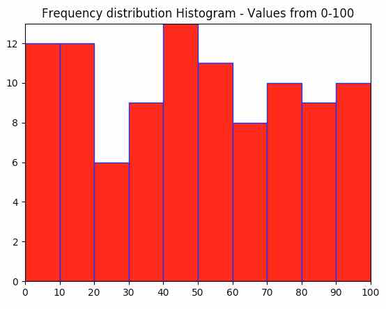
Example:
|
import matplotlib.pyplot as plot import numpy as np
# Random number generation from 0 to 100 x1 = np.random.random_integers(0,100,100)
# Plot frequency distribution using histogram plot.hist(x1, facecolor="r", edgecolor='b') plot.title("Frequency distribution Histogram - Values from 0-100") plot.margins(0) plot.xticks(range(0,110,10))
# Display the histogram plot.show() |
Output: