Overview:
- The kernel density estimation plot draws the probability density for a given distribution.
- The kernel density plot provides vital display of information on data which include:
- For a distribution present in a pandas Series, the kernel density estimation plot is drawn by calling the function kde() on the plot member of the Series instance.
- In the same way to plot the kernel density estimation plot for a pandas DataFrame the function kde() can be invoked on the DataFrame.plot member.
Example:
|
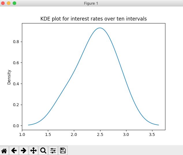
# Example Python program to draw a # Kernel Density Estimation plot # for a pandas Series
import pandas as pds import matplotlib.pyplot as plt
# Interest rate data as a Python list distribution = [2.0, 1.75, 2.25, 2.5, 2.25, 2.5, 2.75, 3, 2.75, 2.5]; series = pds.Series(distribution);
# Draw a KDE plot series.plot.kde(title="KDE plot for interest rates over ten intervals");
plt.show(block=True); |
Output: