Overview:
- A spectrogram is like a photograph or image of a signal.
- A spectrogram plots time in Y-axis and frequencies in X-axis.
- A spectrogram also conveys the signal strength using the colors – brighter the color the higher the energy of the signal.
- A spectrogram explains how the signal strength is distributed in every frequency found in the signal.
Plotting Spectrogram using Python and Matplotlib:
- The python module Matplotlib.pyplot provides the specgram() method which takes a signal as an input and plots the spectrogram.
- The specgram() method uses Fast Fourier Transform(FFT) to get the frequencies present in the signal
- The specgram() method takes several parameters that customizes the spectrogram based on a given signal.
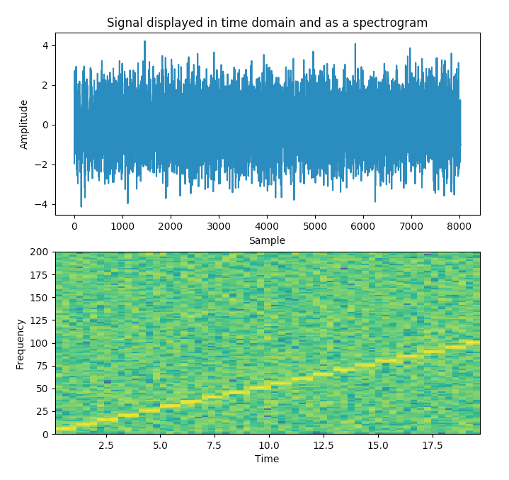
Example:
The Python example program below first displays the signal in time domain.
The program also displays the signal in frequency domain using the spectrogram.
|
# import the libraries import matplotlib.pyplot as plot import numpy as np
# Define the list of frequencies frequencies = np.arange(5,105,5)
# Sampling Frequency samplingFrequency = 400
# Create two ndarrays s1 = np.empty([0]) # For samples s2 = np.empty([0]) # For signal
# Start Value of the sample start = 1
# Stop Value of the sample stop = samplingFrequency+1
for frequency in frequencies: sub1 = np.arange(start, stop, 1)
# Signal - Sine wave with varying frequency + Noise sub2 = np.sin(2*np.pi*sub1*frequency*1/samplingFrequency)+np.random.randn(len(sub1))
s1 = np.append(s1, sub1) s2 = np.append(s2, sub2)
start = stop+1 stop = start+samplingFrequency
# Plot the signal plot.subplot(211) plot.plot(s1,s2) plot.xlabel('Sample') plot.ylabel('Amplitude')
# Plot the spectrogram plot.subplot(212) powerSpectrum, freqenciesFound, time, imageAxis = plot.specgram(s2, Fs=samplingFrequency) plot.xlabel('Time') plot.ylabel('Frequency')
plot.show() |
Output:
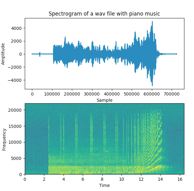
Example 2:
In this python example program an acoustic signal, a piece of piano music recorded into a .wav file is is plotted in time domain followed by the spectrogram of the sound wave.
The frequencies of the tune or the pitch are identified with the brighter yellow columns present in the spectrum.
|
#import the pyplot and wavfile modules import matplotlib.pyplot as plot from scipy.io import wavfile
# Read the wav file (mono) samplingFrequency, signalData = wavfile.read('y.wav')
# Plot the signal read from wav file plot.subplot(211) plot.title('Spectrogram of a wav file with piano music')
plot.plot(signalData) plot.xlabel('Sample') plot.ylabel('Amplitude')
plot.subplot(212) plot.specgram(signalData,Fs=samplingFrequency) plot.xlabel('Time') plot.ylabel('Frequency')
plot.show() |
Output 2: