Overview:
- A signal has many components using which it is described.
- A signal has amplitude, phase, frequency, angular frequency, wavelength and a period.
- The Fourier Transform gives the component frequencies that make up the signal. That is, using Fourier Transform any periodic signal can be described as a sum of simple sine waves of different frequencies.
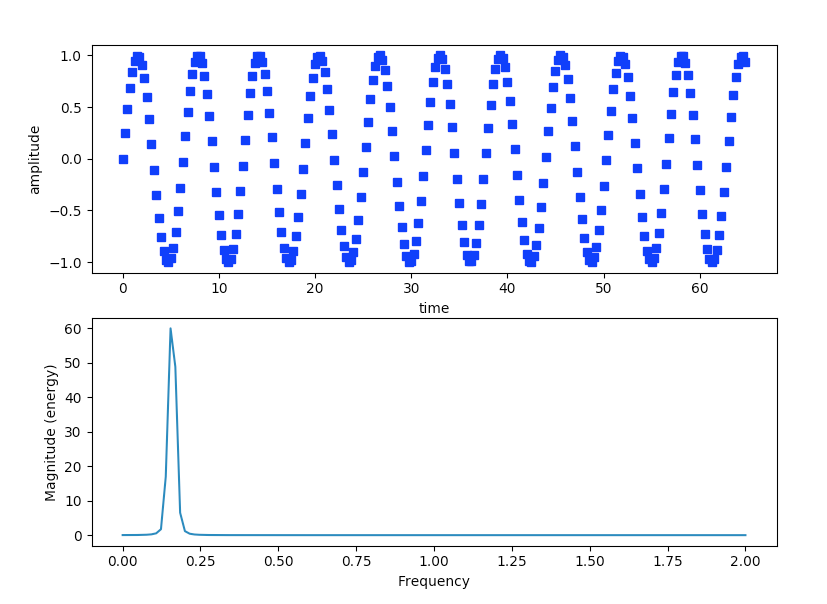
- The Magnitude Spectrum of a signal describes a signal using frequency and amplitude. That is frequency components of a periodic signal are plotted using Frequency Domain - frequencies plotted in X-axis and amplitude plotted in Y-axis.
- The pyplot module of the Python Matplotlib library provides the function magnitude_spectrum() that plots the spectral magnitude representation of a sine wave.
- The Magnitude Spectrum has both a positive frequency component and a negative frequency component. However, the magnitude_spectrum()function plots both the frequencies together.
Example:
|
# import the numpy and pyplot modules import numpy as np import matplotlib.pyplot as plot
# Get time values of the signal time = np.arange(0, 65, .25);
# Get sample points for the discrete signal(which represents a continous signal) signalAmplitude = np.sin(time)
# plot the signal in time domain plot.subplot(211) plot.plot(time, signalAmplitude,'bs') plot.xlabel('time') plot.ylabel('amplitude')
# plot the signal in frequency domain plot.subplot(212)
# sampling frequency = 4 - get a magnitude spectrum plot.magnitude_spectrum(signalAmplitude,Fs=4) # display the plots plot.show() |
Output:
