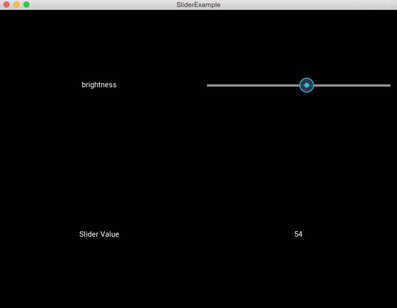
Overview:
- A slider is a UX widget used for selecting and setting a value from a range of values varying from a minimum value to a maximum value.
- Kivy provides a slider widget for app development.
- A Kivy slider widget can be placed in an app either in vertical orientation or horizontal orientation
- The slider control can be specified of a minimum value, maximum value and a default value.
- Kivy supports several slider widget options for customizing the cursor, cursor image, border, background to be used in different orientations, region between the minimum value and the maximum value.
- Kivy also supports dealing in terms of normalized value of the range rather than the real range supported by the slider.
- Normalized value means 0 is the minimum value and 1 is the maximum value.
Example:
|
# Kivy Example App for the slider widget from kivy.app import App
from kivy.uix.gridlayout import GridLayout
from kivy.uix.slider import Slider from kivy.uix.label import Label from kivy.properties import NumericProperty
class WidgetContainer(GridLayout):
def __init__(self, **kwargs): super(WidgetContainer, self).__init__(**kwargs)
# 2 columns in grid layout self.cols = 2 self.brightnessControl = Slider(min=0, max =100)
# 1st row - one label, one slider self.add_widget(Label(text='brightness')) self.add_widget(self.brightnessControl)
# 2nd row - one label for caption, one label for slider value self.add_widget(Label(text='Slider Value')) self.brightnessValue = Label(text='0') self.add_widget(self.brightnessValue)
# On the slider object Attach a callback for the attribute named value self.brightnessControl.bind(value=self.on_value)
def on_value(self, instance, brightness): self.brightnessValue.text = "%d"%brightness
# The app class class SliderExample(App): def build(self): widgetContainer = WidgetContainer() return widgetContainer
# Run the app if __name__ == '__main__': SliderExample().run() |
Output:
