Overview:
- The point plot in seaborn means a scatter plot depicting point estimations for categories with defined confidence intervals.
- Confidence intervals can be replaced with standard deviation using the value "sd" for the paramter ci.
- A point plot in seaborn draws scatter plot points for the point estimates such as the mean of the data.The point plot also draws error lines (also called as bars or glyphs) that are extended from the points to desrcibe the dispersion or uncertainty of the point estimate.
- For Example, If X axis denotes the categories winter and summer seasons and the Y axis denotes the number of birds visited a lake, the seaborn PointPlot() function draws a dot(by default the marker is a dot) for the average number of birds visited on each season. The PointPlot also draws the error bars denoting the expected dispersion.
| Note: The point estimate of an univariate distribution is a single value that summarizes a parameter of the distribution. The parameter could be mean, median and other measures. |
Example:
|
import pandas as pds # Number of bird visits to a lake sbn.set(style="darkgrid"); # Find the mean of winter visits # Find the mean of summer visits # Draw a point plot |
Output:
|
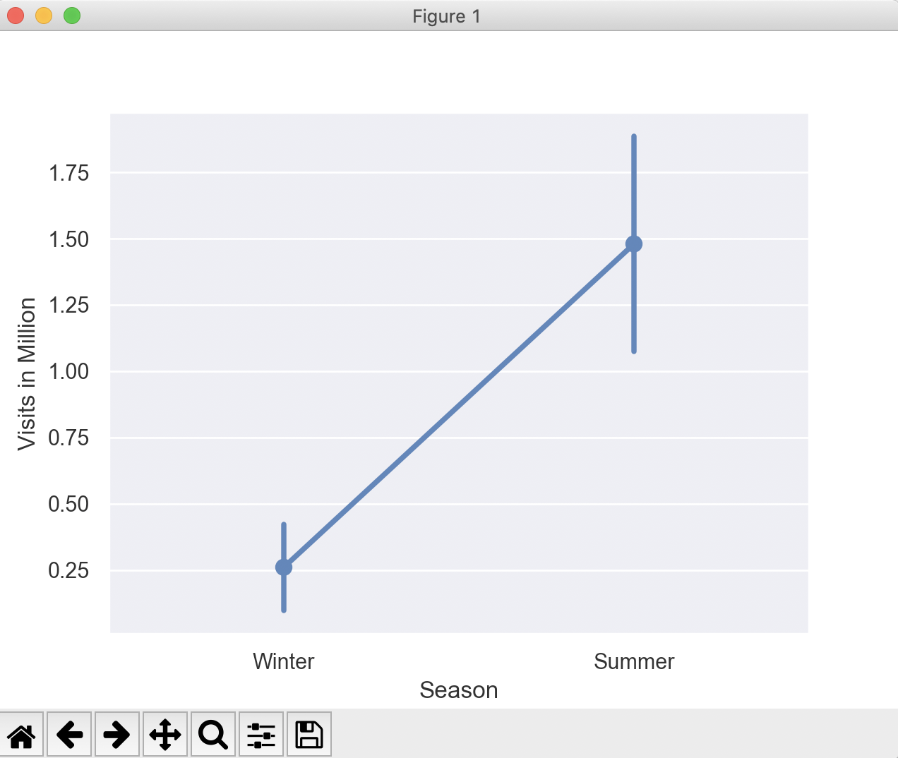
Year Visits in Million Season 0 2001 0.1 Winter 1 2002 0.1 Winter 2 2003 0.4 Winter 3 2004 0.2 Winter 4 2005 0.5 Winter 5 2006 2.1 Summer 6 2007 1.8 Summer 7 2008 1.3 Summer 8 2009 1.2 Summer 9 2010 1.0 Summer Mean number of visits during winter: 0.26 Median 0.2 Standard Deviation: 0.1816590212458495 Mean number of visits during summer: 1.48 Median 1.3 Standard Deviation: 0.45497252664309307 |
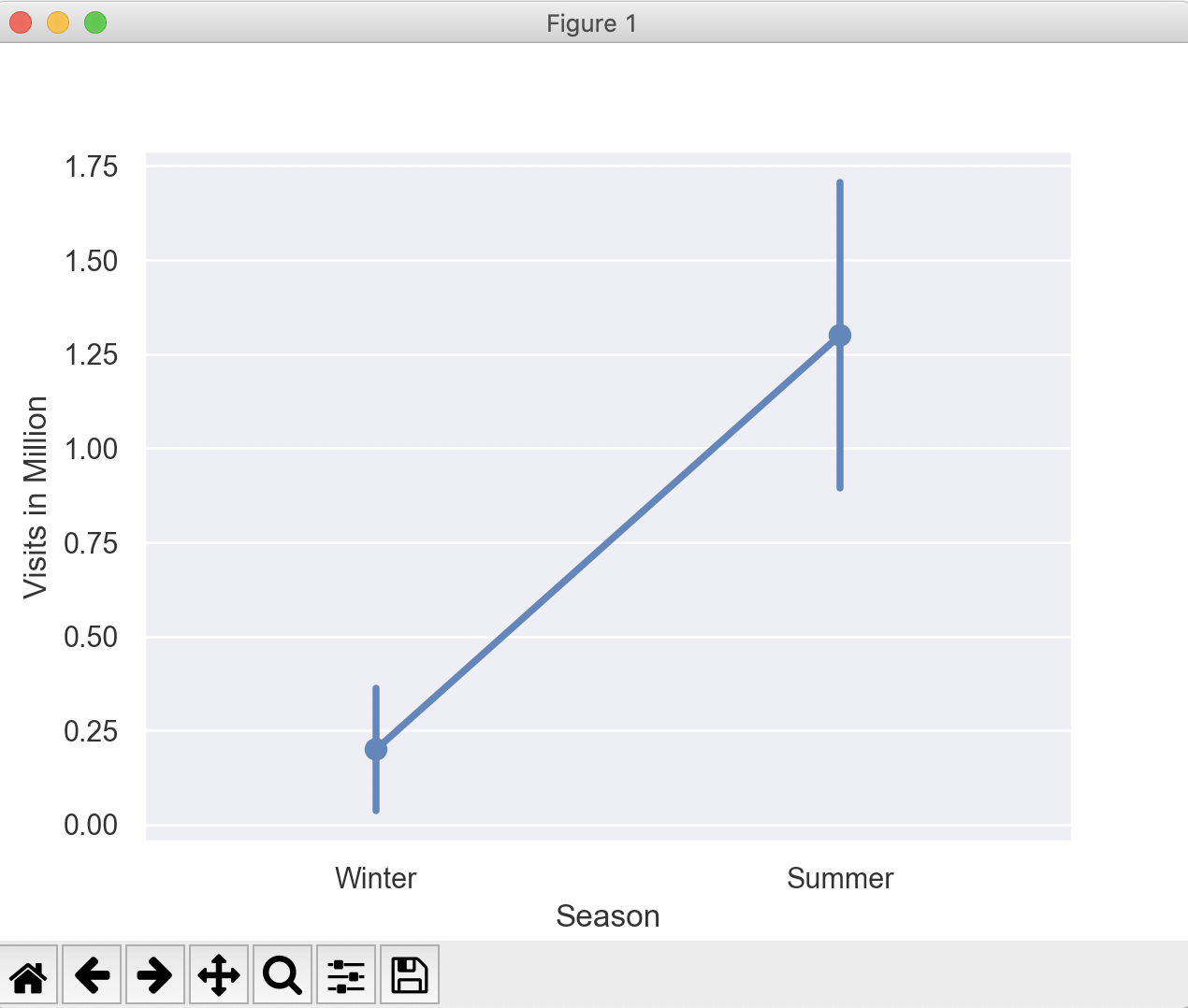
In the point plot below, the dot markers are placed aginst the mean number of visits(0.3 and 1.3) during winter and summer seasons.The error bars denoting the standard deviations are drawn above and below these dot markers.
In the above example, if the pointplot() function is called with the value np.median for the parameter estimator, then the seaborn library plots the point plot for the median values of the categories(i.e, winter and summer).