Overview:
- A bar plot or a bar chart or a bar graph is drawn by drawing vertical or horizontal bars of various lengths in proportion to the data values belonging to several categories. For e.g., GDP of a country during each month of the year can be drawn in a bar chart with each bar representing the GDP from each month.
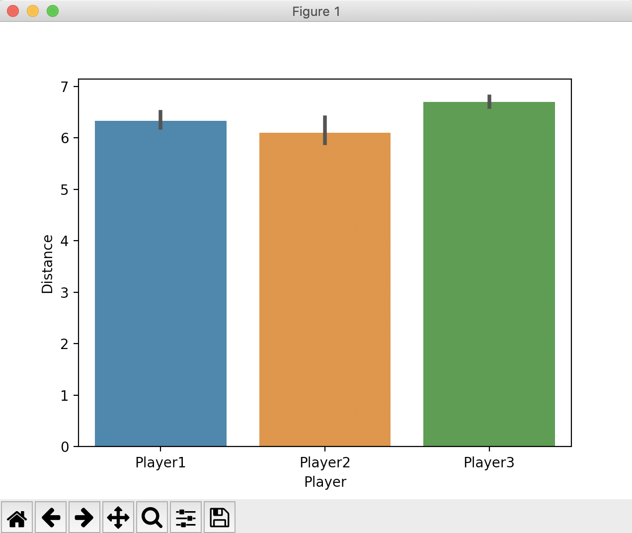
- The barplot() function from the seaborn visualization library draws a bar plot. It internally makes use of bar(), barh() functions from the matplotlib library.
- The barplot() function from seaborn makes few things even more simpler. The function automatically calculates the mean value of the data(i.e., the default point estimate) when multiple data points are present for a category and displays the bar height to this point estimate.
- Seaborn also draws the dispersion of the data, based on the value passed to the parameter "ci"(i.e, denoting the confidence interval). If "sd" is passed as the value to this parameter the error bars will denote the standard deviation.
Example:
|
# Example Python program that draws a bar plot # Players and their trial data jumps = [6.3, 5.9, 6.6, playdata = {"Player":players, # Create a pandas dataframe # Create a bar plot |
Output: